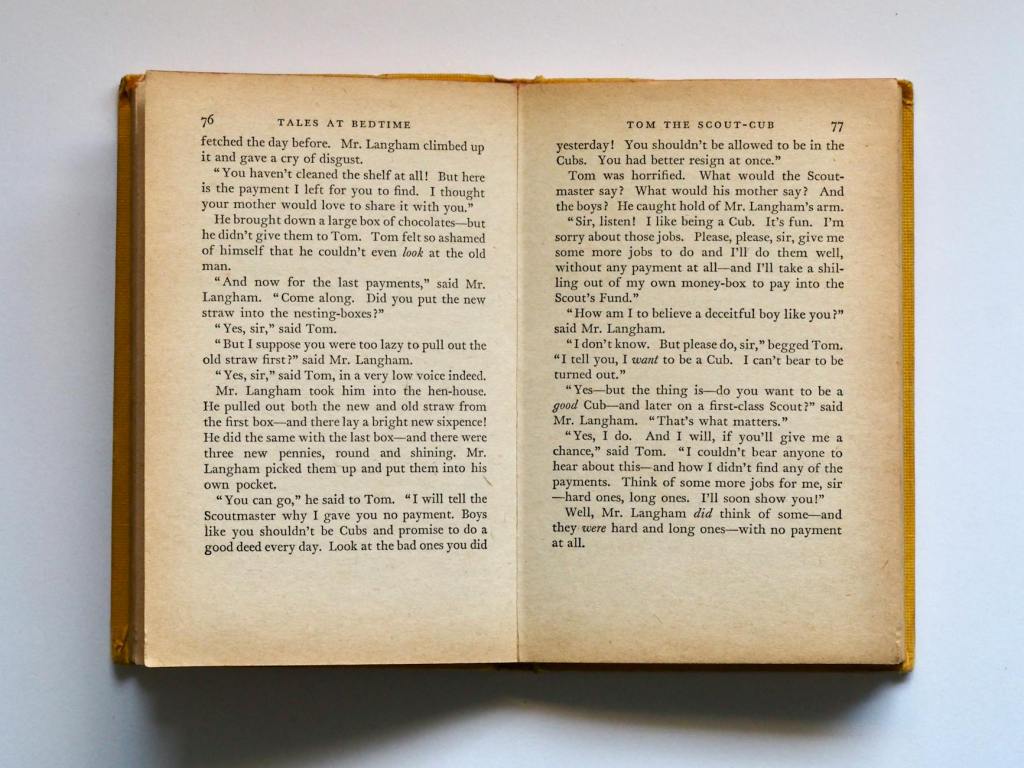
When it comes to publishing, good formatting is essential if you want your book to look professional and, dare I say it, ‘traditionally published’. Even the best writing can look unprofessional with poor formatting, which can distract or even deter readers. A polished presentation not only enhances readability but also reflects the quality of your work.
Below are ten common formatting pitfalls self-publishers often encounter, along with simple fixes to help your book look professional and reader-friendly. Whether tackling these details yourself or working with a typesetter or proofreader, these tips will help you create a polished final product.
1. Indenting the first paragraph of a chapter or after a scene break ❌
The first paragraph should be flush left (no indent), also known as ‘first line full out’. This is standard book formatting (Chicago Manual of Style). All the following paragraphs get that nice indent!
2. Manually creating indents with spaces or tabs ❌
Use proper paragraph formatting instead. Set your first-line indent in paragraph styles. Those manual spaces and tabs will haunt you across devices, shifting your paragraphs and messing up your beautiful format.
3. Starting your chapters halfway down the page in an ebook ❌
This wastes valuable screen space! Unlike print books, ebooks don’t need this extra spacing. Start chapters at the top with clear but minimal spacing.
4. Random line spacing between paragraphs ❌
Choose either indents OR space between paragraphs, never both. Mixed spacing looks unprofessional and distracts readers.
5. Hard returns to create page breaks ❌
Don’t hit enter multiple times to move text. Use proper page breaks or section breaks. This matters more than you think when making edits later!
6. Font chaos ❌
Too many fonts = messy book. Stick to two fonts maximum: one for the body text and one for the headings. And please don’t use Comic Sans in manuscripts. Stick with Times New Roman size 12.
7. Lack of widow/orphan control ❌
Those single lines at the top or bottom of pages look awkward. Enable widow/orphan control in your settings to keep your paragraphs together.
8. Unbalanced page bottoms ❌
It’s a thing! The last lines on facing pages should be level with each other. Uneven bottoms can mislead readers (short pages look like chapter endings) and look messy.
9. Images without proper anchoring ❌
Floating images can shift dramatically between devices. Anchor them properly and consider if they’re really needed in your ebook.
10. Incorrect page numbering ❌
The first page of Chapter One is the book’s main body and should always be page 1. Page 1 should also always be on the right. Front matter (title page, contents, etc.) shouldn’t be included in the numbering.
I hope this is helpful. When it comes to book formatting, the devil is always in the details. Poor formatting can make even brilliant writing look amateur and put readers off. If you’re finding it challenging, consider hiring a professional typesetter before publishing. Alternatively, a proofreader can highlight areas that need adjustment if you’re following a specific style guide like the Chicago Manual of Style. And always remember: format for readability first, aesthetics second. Your book’s presentation is as important as its content.
Happy formatting! V x
